Live Data Walls That Actually Work
Every wall below is live. Click to see how VitalWall handles your industry.
Real data. Real updates. Real use cases. Pick the one that looks like your business.
Event-Driven Walls
React to what users are doing, right now.
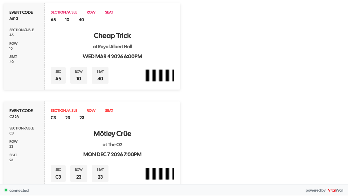
Live Ticket Sales
This wall displays ticket purchases the instant they happen, powered by user checkout events. Perfect for venue lobbies, box offices, and event marketing pages.
Perfect for: Concert venues, theaters, sports teams, event organizers
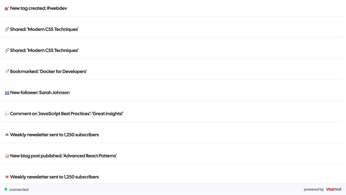
Live Community Activity
This wall displays posts, comments, and discussions as they happen, triggered by user interaction events. Perfect for community homepages, forum sidebars, and team dashboards.
Perfect for: Tech blogs, developer communities, forums, documentation sites
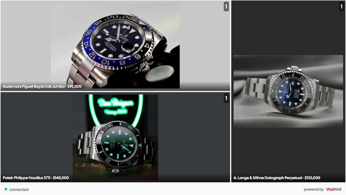
Live Purchase Activity
This wall shows customer purchases in real-time, triggered by checkout events on your site. Perfect for product pages, landing pages, and retail displays.
Perfect for: E-commerce stores, luxury retailers, limited-edition products
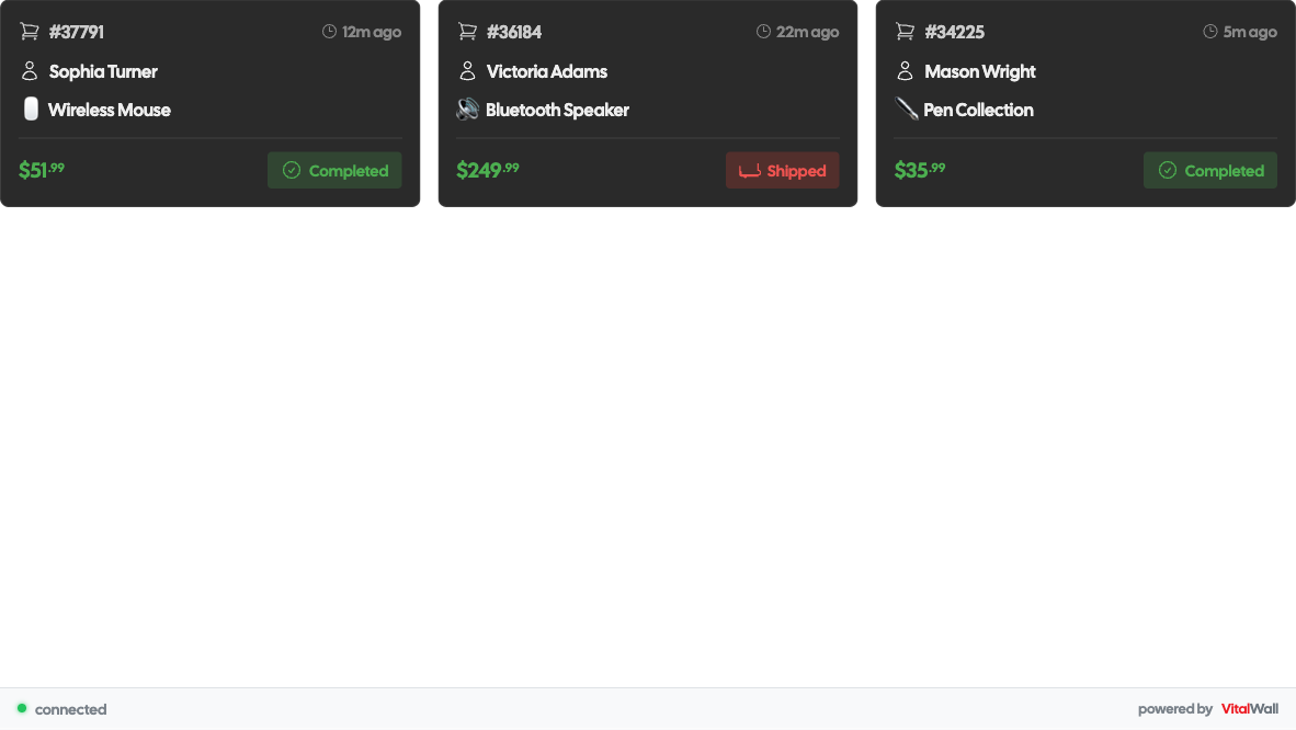
Live Order Feed
This wall displays customer orders the moment they come in, triggered by checkout events. Perfect for warehouse displays, admin dashboards, and e-commerce homepages.
Perfect for: Online stores, marketplaces, subscription services
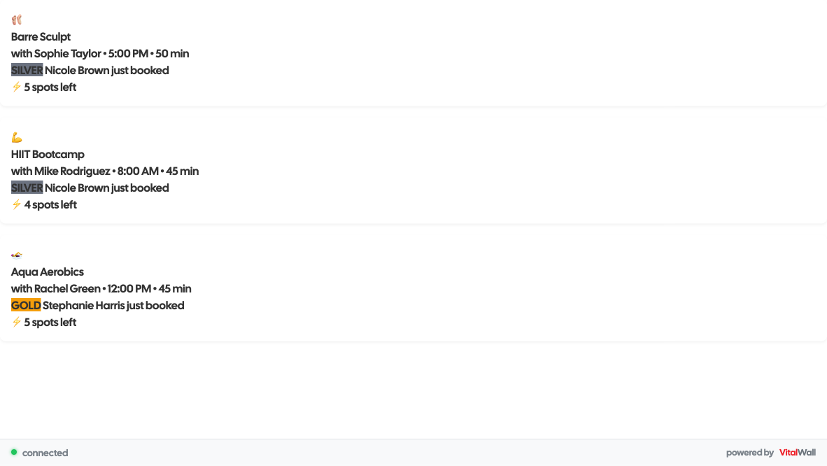
Live Class Bookings
Show members booking classes in real-time. Perfect for gym lobbies, studio websites, and member apps to create urgency.
Perfect for: Gyms, yoga studios, fitness centers, boutique studios
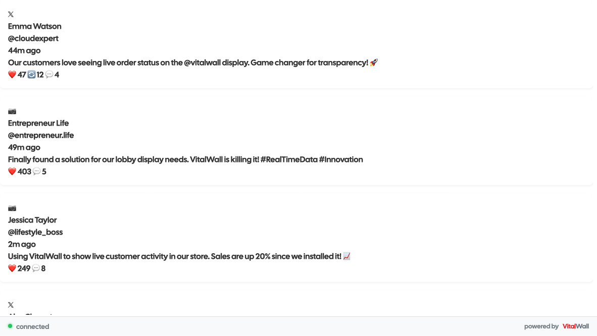
Live Social Proof
Display real-time social media mentions and reviews. Perfect for websites, lobbies, and marketing displays to build trust.
Perfect for: SaaS companies, e-commerce, agencies, brands
New Product Showcase
Highlight new product launches, pre-orders, and exclusive releases. Build anticipation and drive early adopter engagement for your newest offerings.
Perfect for: E-commerce stores, tech brands, fashion retailers, consumer electronics

Multi-Platform Social Feed
Aggregate posts from Twitter, Instagram, LinkedIn, TikTok and more into one beautiful feed. Perfect for social media walls at events, offices, and marketing dashboards.
Perfect for: Marketing agencies, events, conferences, retail stores, corporate offices
Live Review Stream
Display customer reviews as they come in to build trust and showcase real product feedback. Perfect for product pages, checkout flows, and store displays.
Perfect for: E-commerce stores, SaaS products, service providers, restaurants
Event-driven walls show what's happening as it happens.
API-driven walls pull live data from any source.
Mix both. Update in real-time. No polling scripts.
API-Driven Walls
Pull live data from any external source. No polling scripts needed.
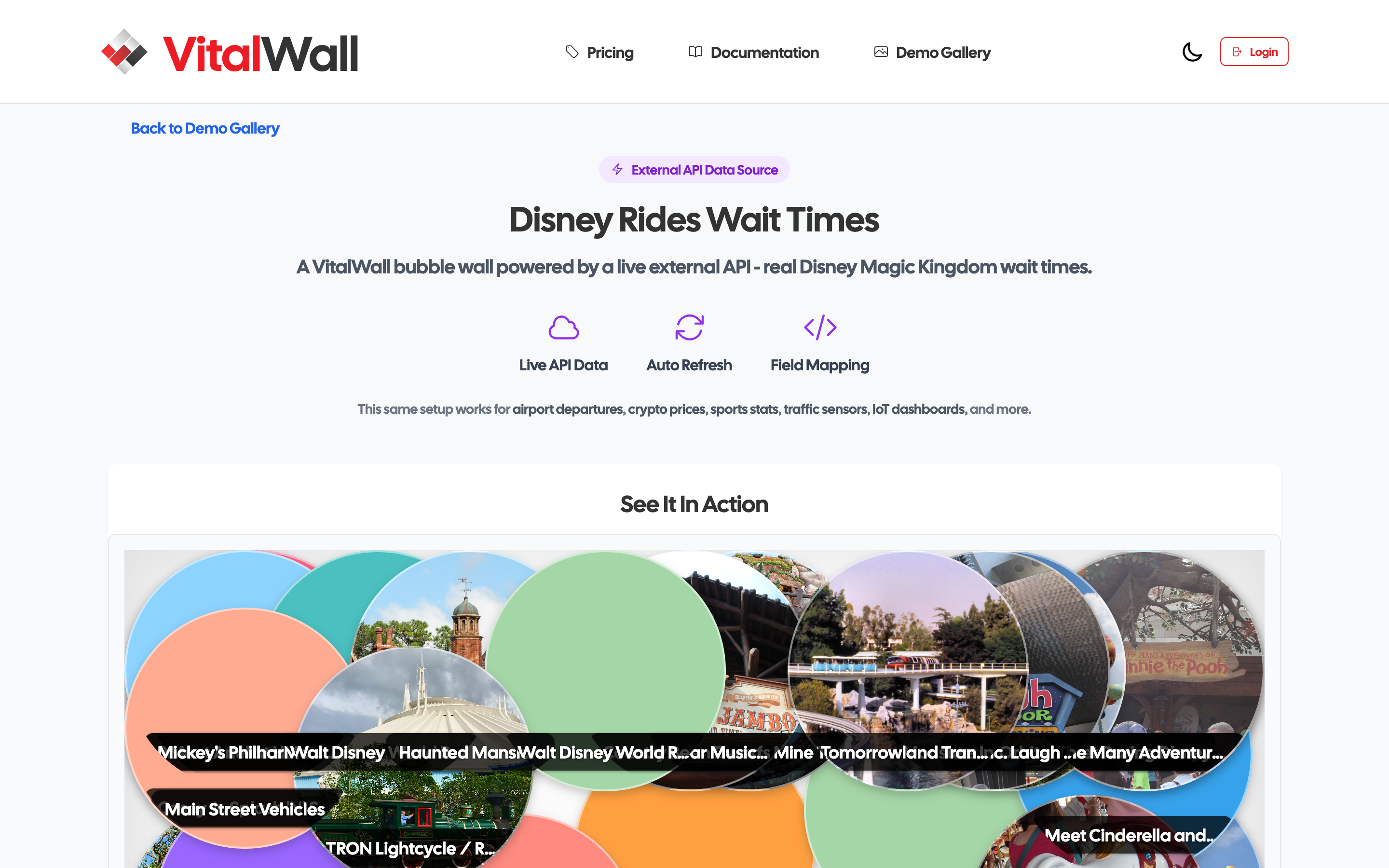
Live Theme Park Wait Times
This wall streams real-time ride wait data from a public API and updates every 5 minutes. Perfect for operations dashboards, status displays, and public monitoring screens.
Perfect for: Theme parks, venue operators, travel apps, status dashboards
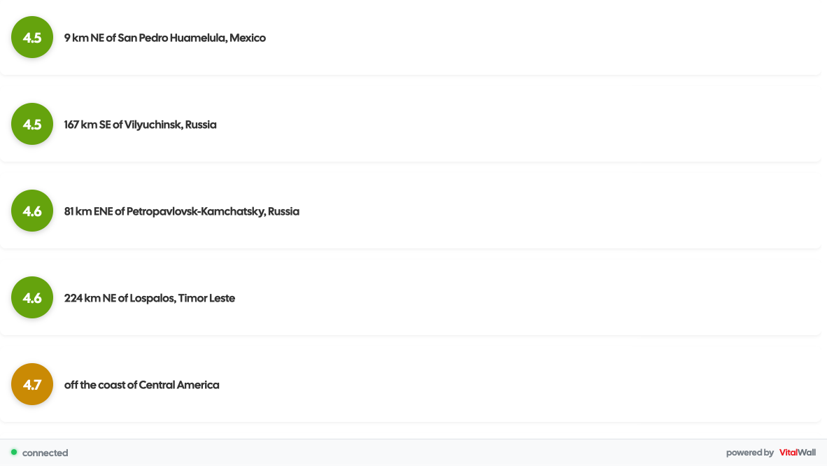
Live Earthquake Activity
This wall pulls real-time seismic data from the USGS API and updates every 60 seconds. Perfect for emergency ops centers, news sites, and safety monitoring displays.
Perfect for: Emergency centers, news organizations, government agencies, safety dashboards
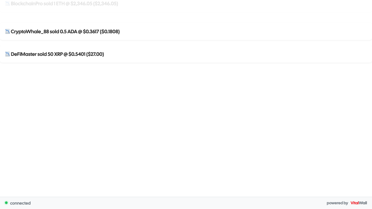
Live Trading Ticker
Display real-time crypto trades as they happen. Perfect for trading platforms, financial dashboards, and exchange lobbies.
Perfect for: Crypto exchanges, trading platforms, financial services, investment apps
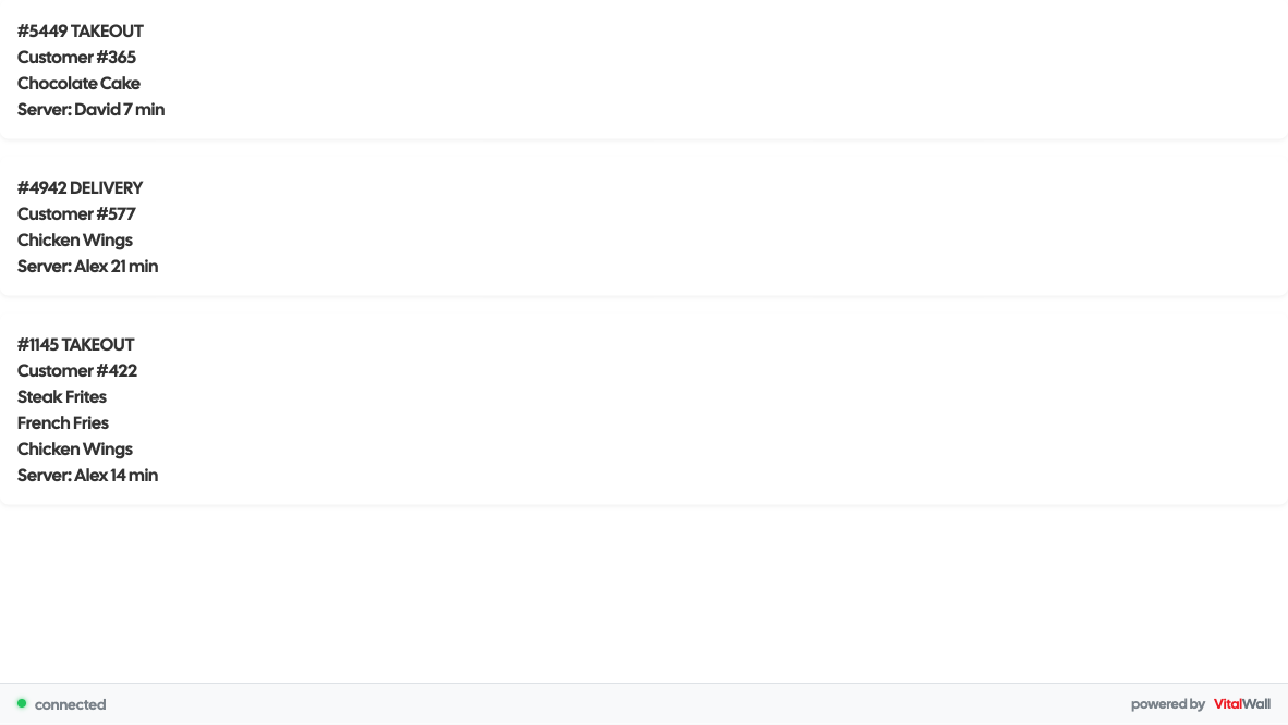
Live Kitchen Orders
Display incoming orders instantly to kitchen staff. Perfect for restaurants, cafes, food trucks, and ghost kitchens.
Perfect for: Restaurants, cafes, food delivery, kitchen operations
Dashboard & Operations
Monitor systems and operations without building custom UIs.
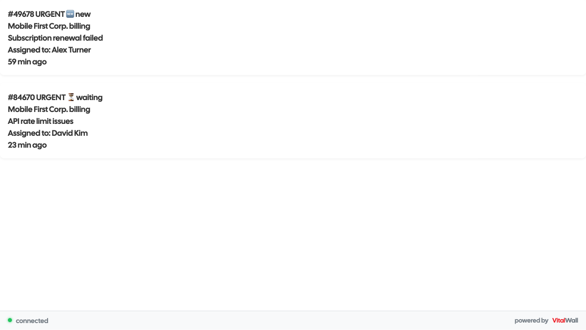
Live Support Dashboard
Track support tickets as they come in and get resolved. Perfect for displaying team performance and customer service metrics in real-time.
Perfect for: SaaS companies, help desks, customer service teams, call centers
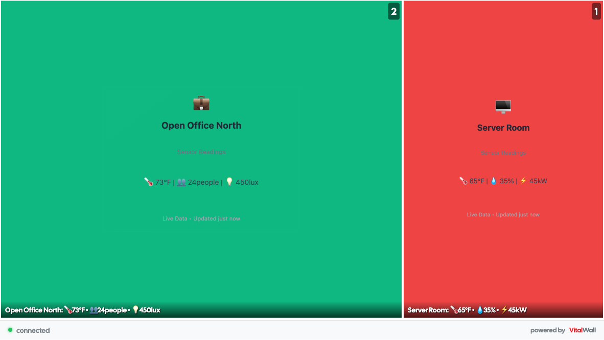
Live IoT Dashboard
Monitor building sensors in real-time with hierarchical visualization. Perfect for smart buildings, facility management, and operations centers.
Perfect for: Smart buildings, data centers, manufacturing, facility management

Live Visitor Map
Display visitor activity from around the world in real-time. Perfect for showing global reach, building trust, and creating engagement.
Perfect for: SaaS platforms, global services, marketing sites, analytics dashboards

Live API Monitoring
Monitor all your API endpoints in real-time. Track response times, status codes, and uptime. Perfect for DevOps dashboards and engineering status boards.
Perfect for: SaaS platforms, API providers, DevOps teams, engineering organizations
Team Collaboration Stream
Show your team's real-time activity including deployments, code commits, task completions, and discussions. Perfect for office displays and remote team dashboards.
Perfect for: Software teams, agencies, project management tools, remote organizations

Live System Dashboard
Monitor CPU, memory, network, and disk performance across all servers in real-time. Essential for DevOps teams and NOC displays.
Perfect for: DevOps teams, SaaS platforms, hosting providers, IT operations centers
Build Any of These in 10 Minutes
No custom UI. No polling scripts. No frontend rebuilds. Just live data walls that work.
No credit card required. Free tier includes everything you see here.